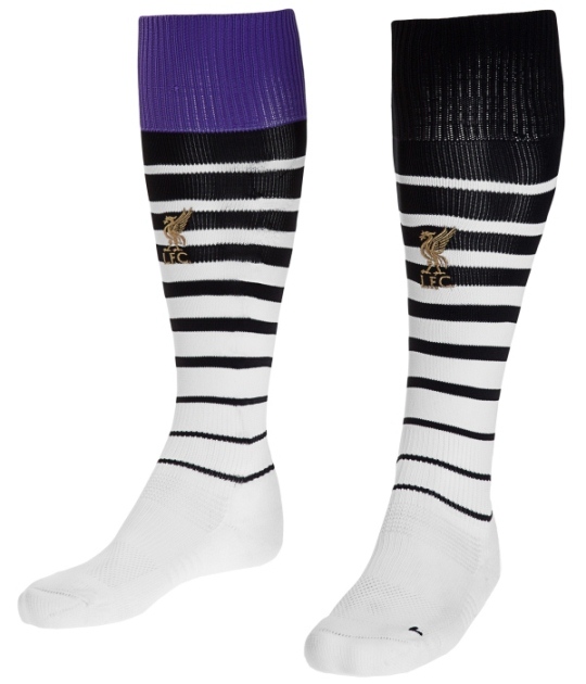
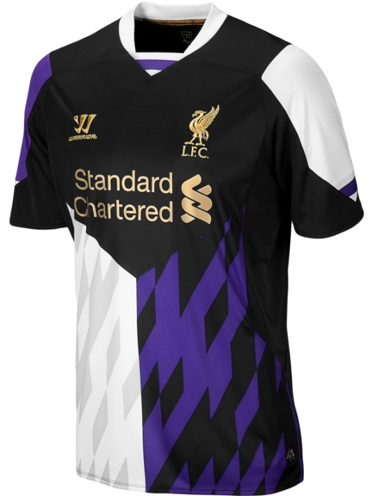
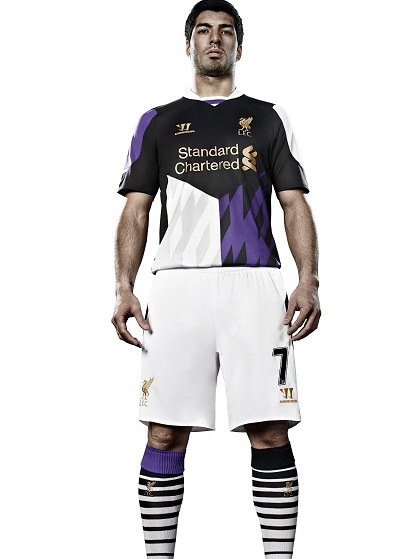
Liverpool have unveiled a new third kit for 2013/2014 that seems to look worse than their recently released new away kit. This purple and black jersey, which in the words of Liverpool, contains a “classic design”, is paired with white shorts and “mismatched” socks. One of the socks is purple, while the other is black, as the pics below will tell you.
New LFC 3rd Jersey 2013/14- Purple/Black/White Officially Released 4th July, 2013


This is actually a nice kit! Although many will disagree :p still love liverpool’s first red kit the most though
Nice kit other then the shorts which should be black
I friggin love’em, which is odd, cause I usually go for simple and classic…
Tomorrow’s headline: In an astounding turn of events, the whole Liverpool squad have put in transfer requests!
I’m sorry but this jersey is pretty ugly. I like the Liverpool jerseys most of the time but not this one!
I am a Barcelona fan and also find their new away jersey ugly as hell – as well as their past lime green away shirts. Oh, God, what are those designers thinking?
When you get a chance, check out my new blog: neymarjr(dot)info
Cheers!
The new Liverpool kits are very cool. The home kit I would probably like a bit more if it still had the collar but it still looks nice. The away kit is different its not like any kit around over the past couple of seasons so again a very very nice kit. Now the new 3rd kit is odd its one of a kind some people have said its ugly however I feel its probably my favorite kit they have released in quite a long time. No team has ever had a purple kit and the combination of purple black and white is one combination that works extremely well. Looking forward to buying the three new kits.
where can i buy them?