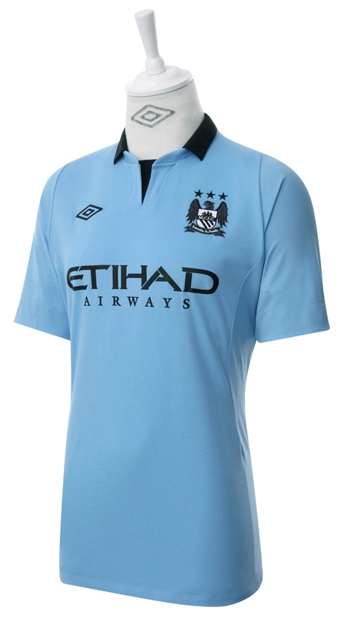
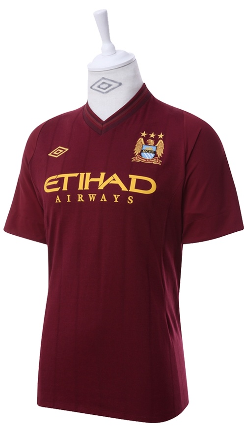
Manchester City have today ( July 5, 2012) unveiled their new 2012/13 season home jersey and 2012/13 away kit as they prepare for the defence of the Premier League title they won in stunning fashion on the last day of the 11/12 season in stoppage time against Queens Park Rangers. MCFC’s new 2012/2013 home kit has been designed by Umbro.
Apart from these new MCFC 2012/13 home and away kits, see Premier League jerseys from Liverpool, Man Utd, Arsenal, Chelsea and other clubs in our Soccer-Blogger’s football shirts section.
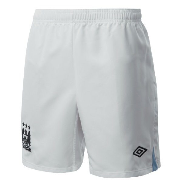
City’s new home and jersey sponsors are Etihad Airways and the kit sees a blue top paired with white shorts ( City’s traditional colours)
The club’s new away shirt is a tribute to the 1956 FA Cup winning side.


its is a epic fail
Away kit’s smashing, home kit so so
correction: Home kit (light blue) is smashing, away kit is strange. Where did the maroon come from??
love it my fella is pleased 🙂
nice shirt!!!
Both Kits look amazing 😀
lol even the kit copy Arsenal’s.
is it me or does that away kit look a lot like an old arsenal kit? theyve basically stolen their players and their kit, well done city scum!
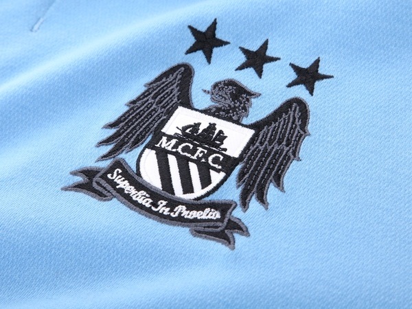
Home kit is okay, change the crest back to normal and yes its good, the away kit I like it.
Nice home kit..really wonderful
Where can i see their third shirt
When does the champions league kit come out ?
I love everything about man city, the jerseys are very nice
We are surely going to use these jerseys to defend our premier league title
Sooo gonna Buy it !!!!!
Man city club very strong team I am written from ethiopia
Y
new kit’s are smashing. previous away kit was slightly better I think but still great ideas.
The Home Kit Smashing
The Away Kit Cool
the kinda no differnce between the home kit
look forward to seeing man city play in their new kit’s. especially joe hart in his new goalkeeper shirts.
Best Team, Best Fans……..Best Dressed.
The kits are fantastic, we’ll look great defending ‘our title’ in ‘OUR CITY’
For the moaning Arsenal fans and people who are asking why maroon? The maroon kit isn’t a copy of Arsenal’s 2005 kit! Look at City’s traditional away colours 1933, 1934, 1956 cup finals they wore maroon. From 1965 to 68 they wore maroon as an away kit and maroon trim on their first kit socks late 60s. Also wore maroon on their socks in the 2011 cup final. It’s part of our tradition get over it!
oh,is very beautiful.
Nice kits… they are really nice-‘-‘- CITY!!
City Forever
I hope man city
From ethiopia man city support
Away kit looks great, What was umbro thinking when they were colouring the home kit? Black-seriously?! And what happened to the emblem!, it’s black and white!! Last years kit looks a lot better!
woooooooooooo its a nice shirt
it s**ks manchester utd is better than youre’s
Any city fan knows, that before the red and black stripes maroon was our change strip 1956, 1934 and the late eighties