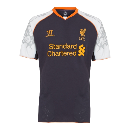
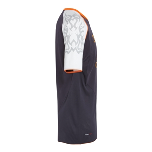
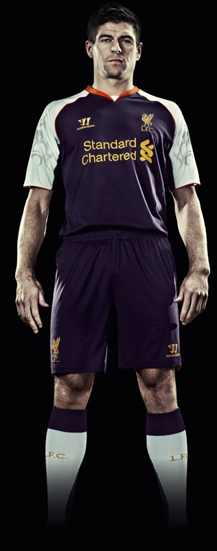
Liverpool’s new 2012/13 third kit has been unveiled today ( 5 July, 2012- 00.01 UK time) by kit partners Warrior Sports. Dubbed to be a nightshade, orange and white creation and inspired by previous goalkeeper shirts worn by David James and Jose Reina, the new LFC 3rd kit 2013 will be worn by the club primarily in their Europa League campaign. The Reds finished a disappointing 8th in the 2011/12 Premier League but qualified for the 2012/2013 Europa League by virtue of their win in the 2011/12 Carling Cup over Cardiff City on penalties.
Like with the other two LFC strips unveiled by Warrior, the new Liverpool Europa League jersey 2012/13 features the Liverbird and has Standard Chartered as its sponsors.
Liverpool’s new 2012/13 home kit and the new LFC 2012/13 away kit, amongst other kits, can be seen in our football shirts section.


not bad at all
Whose idea was it to make the tribal design on this kit?
Otherwise the colours aren’t bad, but that tribal design doesn’t quite cut it
TROLOLOLOLOLOLOLOLOL
liverpool seem to like swimming this year :/
Sucks…looks so cheapy..WTF!
The kit isn’t too bad, but the tribal is horrible. PLEASE no tribal on any of our products next year, keep them simple. The away kit should of stayed black what is that grey thing about? this kit would be ok, without the tribal. the only one they have got ok was the home shirt keeping it classic.
wow this kit is horrific
Third rate manager, third rate kit, small ground, no one wants to come here anymore, players asking for commiment from club (Skirtel), players leaving after being let down with promises.
Get the 200/1 for relegation with Corals
Just saw the strip in the LIverpool 1 store – looks fantastic, won’t bother with the boring plain red shirt or the Star Trek second strip. It looks fun and the colours really work. The tribal tattoo on the arms is a little twee but still works.
that’s fecking ugly liverpool killed it in the world of kits the past two years they went too far first the standard Chartered sponsorship than Carlsberg now this Warrior instead of adidas
Yank pro sports teams, including MLS squads, don’t rock kits with weird imprinted tattoos on the sleeves. Generally those “experiments” are reserved for the college, or amateur ranks where they usually don’t stick. Respected, traditioned teams at the level of LFC, such as the Yankees or Lakers, NEVER alter their looks substantially. If it ain’t broke don’t fix it. Home kits are classy but the tribal is weird and the aways look like monks robes.
It’s not a tribal design it’s in homage to shankley gates. Hope you lot aren’t Liverpool supporters not thinking of that before you thought tribal.
All 3 of Liverpool’s new jerseys are unattractive. The home shirt is plain boring, while the away and 3rd versions are ugly in design and colour combination. Which designer(s) did Warrior Sports engage? Dropouts from the school of design? The kits produced by Adidas were by far the best. Even the Reebok and Umbro jerseys far outshine these duds from Warrior.
Hello, I think that the new kit is ok, but it doesnt attract people’s attention, now the red kit was very nice colour and it brought attention to supporters. the purple looks a very darkcolour and makes the players look very dull, the red uniform was bright and was shown to be very bright and made the players look lively!
Yours truly
Lauren.x
Were can I buy this from now???
SHUT UP!!!!!!!!!!!!!!!! This kit is amazing and thank you very much….we are CHAMPIONS!!!!!!!!!!!!!
So shut ‘lfc supporters’ as u are just jealous man utd and chelsea supporters……
YNWA
This kit is amazing can’t wait to get it tomorrow!!!!
The black and highlighter yellow 3rd strip was great….I was annoyed it sold out at Sports Direct!
The entire LFC set of strips this year is average to poor. 1st is OK, 2nd is horrible and 3rd just looks tacky.
The second strip should have been classic like the 1999-2000 green and blue strip. Cool colours which go together and stand out.
I don’t want to offend anyone…but I probably will….If you like LFC’s 2nd or third strip you have no taste or style.
Please go back to the blue, black and white shirt. It’s much more beautiful than this. Liverpool is much greater than it. “PLEASE HEAR US”.