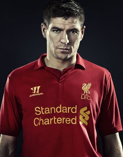
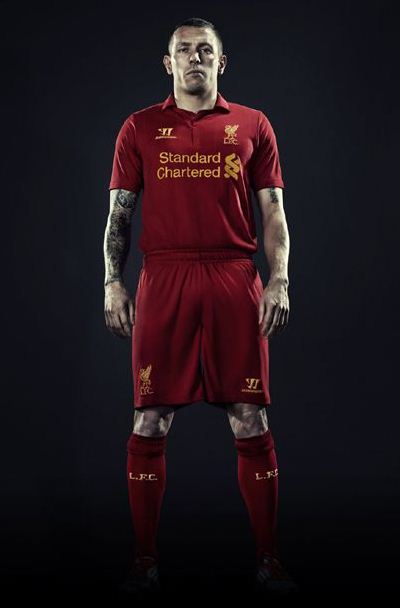
Liverpool’s new 2012/2013 jersey has been officially revealed to the public today ( May 11, 2012) by LFC and their new kit designers Warrior Sports. We had earlier reported how the Reds had inked a new kit sponsorship deal with US based Warrior to replace Adidas, and this new LFC 2012-13 home kit is the first creation for the club from Warrior Sports.
Liverpool are the latest club to unveil their 2012/2013 strip, with Chelsea, Arsenal, Swansea, Newcastle, Stoke City and Norwich City having already done so. Warrior have gone for a retro look for this new Liverpool top, replacing the club crest with the Liver bird badge.
The Warrior logo is also yellow in colour, with banking giant Standard Chartered continuing its financial association with the club.
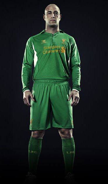
Pepe Reina’s 2012/13 goalkeeper jersey is green in colour. Another important fact to note is that this jersey is for a single season, while LFC’s previous Adidas jerseys were always for two seasons.


Niceeee
Me likeee
Best looking premier league kit so far
well done warrior
Its understated, but very classy.
Return of the Liverbird as a symbol and crest – brilliant.
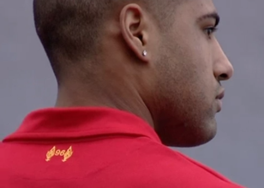
Also like the *96* on the back of the collar.
Great job Warrior…Adidas are a hard act to follow, this is a great kit.
COME ON THE REDS for 2013 !
Absolutely love it!!!Love the retro liver bird badge and the 96 on the back is a really nice touch. Cannot wait to get one. Well done Warrior!YNWA
good job warrior sports but i just feel its a little old fashioned
Back to the old days…. Quality
Class, real class
Take a bow Warrior- I had my doubts, but this LFC jersey is one really good looking kit
Holy crap… why people think this is nice?
It looks cheap and sloppy… the LFC bird logo is a plus, but I don’t think it saved the entire image because if you cover that part… the entire jersey is a wreck!
Brilliant. Love the retro look.
Deeniale you have not got a clue what class is! Have you seen the cheap crap that Adidas has been passing over the past 4 to 5 years? There is always one!What a Twatt!
Wot a top will defo buy it !!!!
smart…plain and simple…nice touch with the 96 on the back..well done warrior
Look cool . But why not Suarez? And why Bellamy?
Best kit in years top job warrior!
Nice kit
why do people think its nice
it looks weak and old
but the bird is nice
Love this jersey, what a classic.
Going to get the full strip for myself and the kids, well done warrior and LFC!!
The worst kit I’ve seen in 32 years, atrocious design, well said Deeniale, whoever thinks this kit is nice needs a trip to Specsavers. This is what happens when you give the contract to an American company with no idea of football shirt design, GHASTLY.
Thank god we’ve done away with them cheap tacky 3 stripes down the sleves .What a truly slick class kit design pat on the back to warrior sports (new balance) oh and a great touch with tribute to the 96 on the back …YNWA
love this shirt, very old school which is a good thing!
Deeniale, honestly, don’t leave ridiculous comments like “It looks cheap and sloppy” REALLY…? Adidas kits over the last 4 years where TERRIBLE, EVERYTHING on the front of our Adidas Jersey was a transfer, STUCK ON, and we paid £45-£55 for it… And just look at Man’ure’s Table-cloth kit, …now THAT’S cheap and sloppy. Embroidered badge and logo always looks class. I for one think this is the best looking Lfc kit we’ve had in over a decade. Well done to Warrior. As the Yanks would say:- “HOME RUN”
absolute disgrace removing the etrnal flame from the badge
I love the Liver Bird logo. I have to buy one
haha shit shirt to go with your shit players enjoy another year battling to stay in the top 10
Awesome kit warrior so cool 🙂
I think it’s Brilliant, Best Kit in Long time, Adidas always seemed to brush us to side and give the likes of Chelsea and Real Madrid the Best Kits, Even Reals Away Red was better than our Home…. Warrior has brought back the old days, BOLD plain Colour, simple, a LIVER BIRD upon the Chest!!! a STATUS & MESSAGE to opponents, to say WE ARE LIVERPOOL FC, Yes its simple BUT STRONG!!! Those were the days Teams were scared to come to ANFIELD, and hated the presence at their ground, as the 12th Mans voice rattled their grounds, and over took their own 12th Man….. We need to re-install that fear!!! And for the 96….. pure class!….
Those who seem not to like, you need to take a hard look, then look again and then look again, watch your self fall in Love!! Excellent Warrior, done us proud!! YNWA!!!
This is a REALLY nice strip harks back to the old days, was bit concerned we had lost the ref to the 96 from the front badge but nice touch placing it in a new position.
I look forward to getting mine.
For those who think this shirt is cheap and sloppy need to get there heads tested. It show real class unlike the dribblin shit that nike or addidas brings out every year. 96 on the back just shows that they have not just thrown a cheap end nasty shirt together, best shirt made for a long time by far and bringing back the liver bird just tops it off
Bigback it gets worse every time I look at this american trash of a shirt, cheap, tacky trash
Is it pure cotton? Big aussie lfc fan here and haven’t seen any real prototypes. It is classy but a little like MUFC’s from 10/11.
best kit for liverpool , love it, will grab for it
nice warrior product
Didn’t like it at first glance but after a while I’ve grown to appreciate it n love it. U guys are right, retro, quality n it’s not tacky for sure. Like the fact that the badge is embroidered unlike the one produced by Adidas. Great job Warrior Sports.
so classic…. nice design… but the colour look weak.. must use the real red…. look strong….
Great idea using the 96 deaths as a marketing gimmick. Lap it up you wankers!
Whoever think that the kit is great, they need to have brain surgery. Contender for flop of the season
Micky – It’s called respect, you sad bastard!!!
Micky May…….. I hardly think Warrior are using the 96 as a “Marketing gimmick” …Seriously mate, I think your comment is a bit harsh. You have to remember, our crest was changed significantly in 1992 where it was altered from a large LIVER-BIRD to large “LETTERING” saying “Liverpool Football Club” You could hardly even SEE the Liver-Bird for Christs sake. And WHERE on the Reebok/Adidas crests did it even MENTION the Hillsborough victims? Their loss and our quest for justice is now enshrined on EVERY SINGLE LFC SHIRT WORLD WIDE. Non Liverpool fans and non football supporters around the world will ask: “What does that 96 mean?” ……let the education of the masses begin about one of the worlds biggest cover-ups. I think this change has been a long time coming. And I for one, believe the fallen 96 would give their blessing. WE WILL NEVER FORGET, WE DEMAND JUSTICE… badge or no badge.
Great kit. Simple and classic . By the way warrior new balance are a very good company with a whole made in England collection, not made in saipan sweat shops.
And by the way Nike and umbro are American companies if you want to get into who makes what.
I like the shirt, I like the design … BUT something is missing!! The You’ll Never Walk Alone is part of Liverpool … It should be there. I realize the flame is on the back of the shirt, but isn’t part of what Liverpool is today is the YNWA? They could have added it somewhere. I really wish they hadn’t taken that away. That’s a bummer.
We’ve all got our own opinions but I like this. Tired of adidas and co. producing the same style shirt but different colours. I like the Liverbird badge but did think losing the Hillsborough flame was a bad move but now I have seen the flame with 96 on the back it’s good that it’s remembered. My only suggestion is the 5 stars for the European wins around the Liverbird would have been good.
Just seen it for the fist time LOVING IT
Just seen it for the first time LOVING IT
Nice apart from Warrior, get Adidas back and it will be sick.
crap.. it will look like bunch of kids playing soccer.. go back to school
Different people have different opinions on design – in any case, performance and attitude lies within the players and manager themselves. Whether the kit is fashionable or not doesn’t matter to me – what matters is Liverpool Football Club. You’ll Never Walk Alone.
Brilliant kit. Unfussy, nice detailing and delighted to get rid of that dreadful 90s badge, and a good touch to keep the memorial on the back.
Nice. Love the retro look, though I’ll miss having YNWA featured. IMO the best looking LFC kit since 2007. If it looks good in person it may be the first kit I buy since Liverpool carried Carlsberg as shirt sponsor.
And for everyone knocking Warrior as being a cheap American product, piss off. Warrior is rapidly becoming a respected competitor to the likes of Nike and adidas – and nobody seems to have issues with Nike, an overpriced American product that churned out the atrocious 12/13 Man United kit.
nice old school look can’t wait till it hits south africa and now for mr henry and co to pull in some marksman to help suarez do wat he is suppose to do lets bring the fear back to anfield