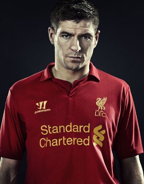
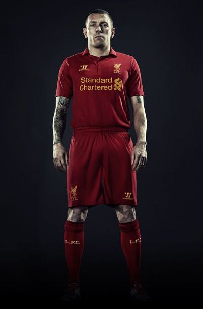
Liverpool’s new 2012/2013 jersey has been officially revealed to the public today ( May 11, 2012) by LFC and their new kit designers Warrior Sports. We had earlier reported how the Reds had inked a new kit sponsorship deal with US based Warrior to replace Adidas, and this new LFC 2012-13 home kit is the first creation for the club from Warrior Sports.
Liverpool are the latest club to unveil their 2012/2013 strip, with Chelsea, Arsenal, Swansea, Newcastle, Stoke City and Norwich City having already done so. Warrior have gone for a retro look for this new Liverpool top, replacing the club crest with the Liver bird badge.
The Warrior logo is also yellow in colour, with banking giant Standard Chartered continuing its financial association with the club.
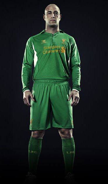
Pepe Reina’s 2012/13 goalkeeper jersey is green in colour. Another important fact to note is that this jersey is for a single season, while LFC’s previous Adidas jerseys were always for two seasons.


Although I like the new additions to the kit, I dont like the collar or the fact that the new kit is only for a single season
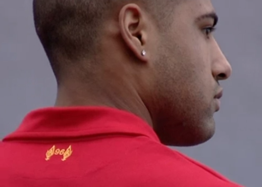
listen guys its not going to be everyones taste but personally i love it and will be getting it for me and the kids, we could all say it could of had this that and other but it is what it is, and for sure i dont think they have cheapened it by putting 96 on the back i personally believe this to be a great position as now they have there own symbol/number and yes many will ask about what it stands for.
So guys and girls i love it and we will look good and play better i have faith
Y.N.W.A
Everton Fan, I like the way they havnt completely remove the torches and added them on the back by also showing respect with the 96, other than that I also think it is a nice kit, plain but affective.
Love the new kit all red most effective .
25 November 1964: The day that Liverpool first wore their now famous all-red kit. Bill Shankly got Ron Yeats to model initially red shorts to match the shirt, and then told him to throw on red socks as well, to complete the outfit. Upon seeing him, he exclaimed “Christ, Ronnie, you look awesome, terrifying. You look 7ft tall.”
great kit. Pleased that they got rid of the cabbage patch. way too much green for success.
Wheres the 39. On the seat of the shorts
this kit is terrible why would you wear that kit i do not know.i mean some of the features are good for example i like the crest i like the 96 at the back however there can be improvements like getting a richer red and getting read of warrior i personley think we should go for umbro.Also i
think we should stick with white rathere than yellow,
how much is the actual kit ?
Love the new shirt nice to see an embroided badge instead of a printed one and the 96 logo is a nice touch, cant wait to see the away shirt.
I have to say its okay but come on the flames and the 96 is a nice touch but why on earth is it on the back it should be on the front! Americans dont have a clue about the flames, the flames are on the front for a reason.. disrespectful!
This is the worst kit kit ever. Top to bottom full of crap. Are people blind? Material looks of poor quality and shirt looks even poorer with the warrior logo. Adidas is quality and we shod have stuck with them. Of course they were not going to give us the money we wanted as its true we have been useless for about 5 years and have not been successful. Don’t the fans realise the home kit will be changing every season now and if people buy the kit that is how they can offer us all this money??? Wake up smell the coffee, changing the club badge?? Why?? Nothing wrong with the on now!! Insult to injury they put the 96 at the back. Again why?? If you leave the badge you would not insult the families who lost loved one and like the previous comment Americans are very clever at marketing it just not on. Lastly, why are fans so obsessed with the past. Move on to new and better kits that’s the problem with this club as keep on living in the past. Yeah you think by having a kit from the 60s will win us the league or trophy. Your having a laugh. Crap kit crap company Adidas please resign us
its shit
copy from arsenal kit..
I don’t care what other people say… already bought (pre-order) from the LFC online store… also got another free shirt worth £20…
I dont care what people think… honestly yes its simple and not that attractive but what really matter to me is how they play… who knows this kit may bring back the 70’s and 80’s spirit to the 2012/13 season… YOU’LL NEVER WALK ALONE!!!!!!!!! COME ON REDS!!! BRING HOME THE CUP!!!!!
like Dog Shits!!
Love the kit, best kit of premier league so far.Adidas was a big gap to fill and Warrior done a great job!!!!!!!!! YNWA
I was hoping that atleast the Jerseys would be nice cause the over rated squad they put on the field is bad enough. Hope they buy another overrated english midfielder for $20 Million this summer. @hopeforeurope
dont need to say much the kit says it all brilliant job ynwa
Are you all on drugs?
It looks appalling. I for one was over the moon when we had the Adidas kit back and got rid of the pink Reebok gear.
United and Arsenal have Nike, Man City has Umbro, Chelsea has Adidas, Barcelona has Nike, Real Madrid has Adidas, Bayern Munich has Adidas, Inter has Nike, AC has Adidas and we’ve got Warrior!?! – wtf
The kits gone down the dumper like the team – at least it might detract from some of the inept football we are playing at times.
Good luck Adidas – sad to see you go!
Now thats what i’m talkin about
Absolutely pure class!
The shirt is beautiful, and by a country mile the best looking one we have had for decades.
It takes me back to the 70’s when I first started watching Liverpool, our nickname isn’t “The Reds” fir nothing, look at the Adidas kits they
I like the new kit actally i do got it
this is totally an old fashion jersey,it does not make sense at all,why not go back to adidas and get us something more quality?
Worst kit I’ve seen in a long time. Both from Liverpool and any other team. Awful!
This kit is quality, I like it so much that I am having a wank over it right now…. Liverpool need to start signing some better players unlike the shocking ones we’ve got right now: C.Adam he o nly looked a good player bcus he was at a shit team, J.Henderson who had ever really heard of him before we signed him for bloody £16m for god sake and S.Downing he really is a downer isnt he, what 0 goals and 0 assists in the PL last season for £20m that’s so bad that I think liverpool have lost their whole ethic and it is a club relying on the past to get itself out of trouble, trusts not a club that I want to support, I think I might go and support Everyone instead……
I’ll agree with those who think the shirts are appalling, it is so plain to see. Must be Warriors’ own staff posting that the shirts are great? The home shirt is more of a golf shirt, Tiger Woods will like this though, the away shirt looks like a scuba top. Thank you for the terrible job, Warriors!
Warrior sports might hav mistaken L’pool 4 a cricket team,dis kit is a total crap n dose who think its going to bring gud luck cos dats wat we wore during da hay days shld wake up from deir slumber,football is played on the pitch.Instead of thinkin about bringin in better players who can propel us 2 de top,liverpudians are here talking about unnecessary tins,Suarez surely ll leave us next season. Untested manager,useless players,sinking legacy,disappointed fans…its about tym we woke up 4rm our slumber!!!!
i’ve seen it in shops and it looks pink. It is a glorified school shirt. Adidas were a billion times better
For me this looks like a normal T-shirt you can wear anytime with the liverpool bird on it.. Not good at all. But I like the “96” mark on the back, nice touch.
Nice…but it looks more suitable to wear on Friday work at d office..:)
Liverpool look good with new jersey kit…….
GOOD LUCK!!!
I’m a United fan forever but admittedly, this kit is smart. Ours is not 🙁
Nice one warrior lfc ure d best
Camiseta preciosa, diferente, no parece ni de futbol ¿os asusta lo diferente?
The kit is nice but we have to sack the coach of not bringing good players