See Man Utd Away Kit 2012/2013 here- released 20 July
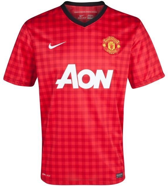
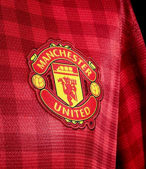
Premier League giants Manchester United will be wearing a gingham kit for the 2012/13 season, as per the official kit revealing by the club on 11 May, 2012. United’s new 2012/13 gingham shirt was revealed in phases by Nike and we had put up pictures of those teasers as well as a leaked photo of what the full shirt had been expected to look like prior to the official release. Man Utd’s new gingham top hasn’t been universally popular with fans, with many labelling it a “tea towel” design by Nike.
Nike have already released Arsenal’s new 2012/2013 home kit that also drew mixed reaction for its hooped sleeve design.
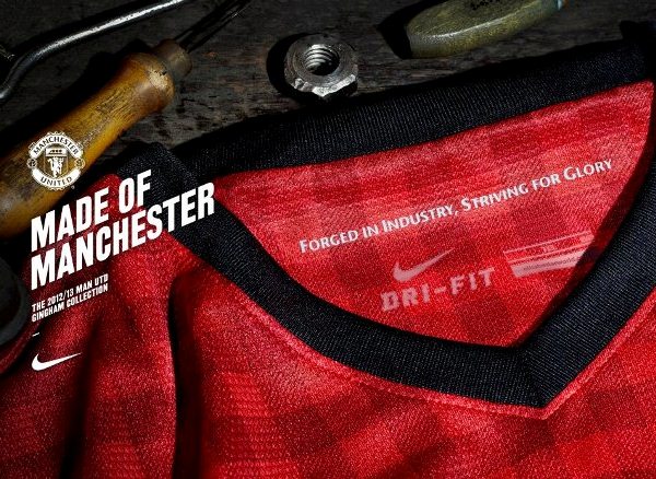
The new gingham kit is a tribute to the mills of Manchester, which started producing gingham in the 18th century.
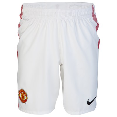
Here are some pictures of Man U’s new 2012/13 home strip, which sees a gingham inspired top paired with white shorts and black socks. The GK jersey is green in colour.
More released Premier League 2012/13 kits can be seen in our football shirts section.
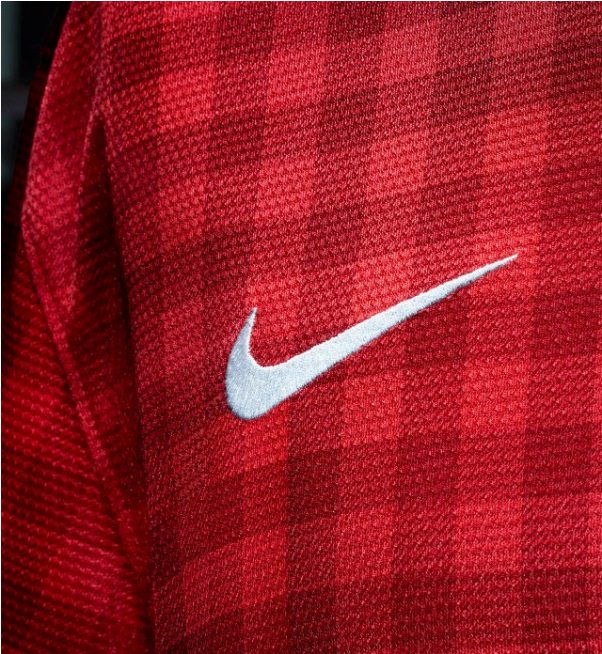
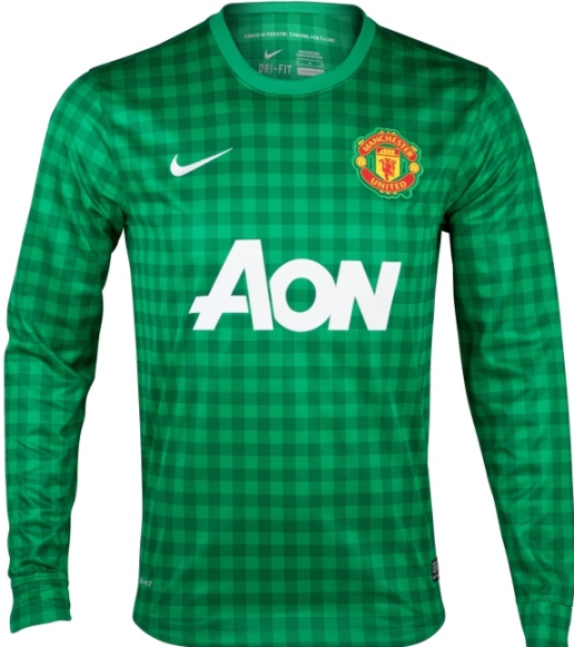
( Edit- 11 May 7am GMT, 2012- bottom image replaced with a more accurate looking leaked photo)
Minus marks/10 to Nike for this creation
I’m not too convinced by the history aspect
No, no, no!
Does look like a tea towel i’m afraid
f nike why will they do this to us
HAHAHAHAHA!! I can hear it from the terraces already…
Chants of ‘you’re wearing a table cloth, you’re wearing a table cloth!!!’ will be ring in the ears of Manure supporters.
CTID
copying the city kit but a shit version utd just want to be like city
As if you said united want to be like city! Because we want to go the next 44 years without a Premier League title…
Fact: The bottom picture is a fake the square patterns are smaller and look much better on real jersey…
Awful looking shirt
Tons of discarded table cloth? Problem solved.
one of the worst jersey ever !!
More like City are copying Ac Milans kit! retards
I reckon the kit is nice! how can united be copying city! we’ve never won the leauge on goal difference always points, and we’ve kept up with city and look at their team. Get your facts straight!!
no likey no buyee
horrible, cant wait until the next shirt.
what were you thinking.
This kit looks Maasai like
What in gods name is nike playing at, is this table cloth suppose to be a joke, who cares about the cotton industry, the manchester city fans will be buying us tableware to put on us next, laughing stock!!!!!!!!!
I quite like this kit
It will still sell they have had far worse than this one
Who cares what the shirt looks like??? We should all be more concerned as to how we get our trophy back!!
hahaha. it looks like a poor defeat jersey in europe. This looks like a towel. hahahaha.
shame……..! man city forever
What C**T designed this?? What a load a rubbish!
Manchester United FC should be ashamed with it’s replica football shirt
The cloth seems like a cooking apron.
yea why dont we go back to addidas or umbro nike do trainers not football shirts ihavent bought one shirt yet that they have made there all shit
I think Nike is trying to drive some Man Utd fans to become Man City fans. I bet they’re going to sponsor Man City’s jersey soon and come out with a better design. When both sides have enough fans, Nike is going to force both sides to share a new Red and Blue checkered jersey. Ultimately, this will realise the dream of creating the world’s most expensive tea towel.
Is it Towel cloth or table cloth…very cheap material.Am really ashamed
Manchester united new kits is beautiful made well then this season 2012,its looks more batter then previous season,i think is nice,good job from Nike.
its a table cloth
Why are nike designing kits, at best they should be manufacturing them if this monstrosity is anything to go by.
Shirt sales will be down 70% at least.
Sean is right, the bottom picture is fake. If you look at the logo in the second picture, it’s six squares across, while the bottom one is only three. Huge difference, I think.
Does City paid to Nike to ruin Utd’s kit?
My Lord,this is horrible sh*t
Haha City definately nike fr this ugly tablecloth shit
ya ampun! asli kayak taplak meja!
translated: OMG! truly a table cloth!
Common guys/gals.. make up your mind.. is it a table cloth or tea towel??? LMFAO!!!
Stop being numpties there’s nothing wrong with it. Can’t even see the check pattern when you are 6ft away.
We are Man United we’ll wear what we want
its actually not bad
hahahaha that’s nike for you, adidas won’t ever create an eyesore such as this even for liverpool…
HAhahahaha – that is the ugliest kit design I have EVER seen! Tea towel indeed!
Arsenal’s new kit, isn’t bad – a bit American but its cool!
b4 you critisize ths jersey,make sure u have atlist 2 previous jersies.athaws man utd daent rily mind if u dnt buy the jersey,it’s bettr off wthout ur loudmouth
does it really matter kit united play in? it’s all about going out for a brand new season and beating shitty city!
by wearing this.. united will finish 7th next season , looks clown are playing in OLD-traford
oh shut the hell up guys its a nice kit either back your team united or f off to the scum man city
Oh my god! It is really looks like tea towel or table cloth! Don’t you shame to wear it ? Glory Glory Tea Towel ^^
All you lot need to learn how to spell and write sentences, I’m well aware that short hand is the norm on the net but come on, half the sentences on here are illegible. Bunch of ingrates. The new top’s the best they’ve had in a long while better than the default…
It is really hard to care about any of your opinions when your writing is so ridiculously hard to decipher.
Anyway this happens every time there is a new shirt. Everyone will get used to it and ultimately like it after 3 months.
Man Utd if you know what is good for you then pls plead with ADIDAS or UMBRO to kit the team. Gradually Man Utd is losing it fun base with such a horrible shirt design. The disgrace of okra is a cassava shame.
Shaaaaammmmmeeeeee nike for disgracing Utd.
who wears a tartan to a football match
well.. have to get use to it.. 😀
Can’t believe we have to play in this. The day that Liverpool announce their strip, which I have to say looks fantastic, we announce this rubbish.
those are my pyjamas
On the bright side, when the Glazers don’t pay to upgrade the side, you can use it to play checkers on during all the tedious matches you’ll be watching.