Click here to see Arsenal’s Away Kit 2012/13 by Nike
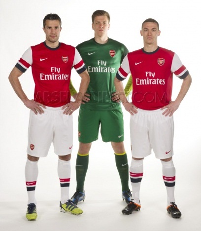
Arsenal have revealed their new 2012/13 home kit today ( May 7, 2012) to add to the other Premier League kit releases from Norwich and Chelsea ( home) and Swansea and Newcastle United ( away). The new Arsenal 2012/13 kit sees Nike introduce a dramatic hooped sleeve design that has clearly split the fans’ opinion of the strip, with some liking the design and others rejecting it outright.
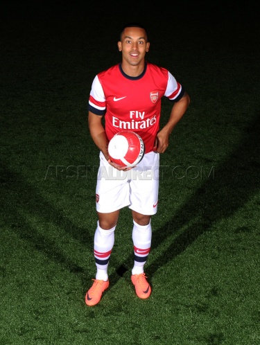
Arsenal’s new home strip for 2012/2013 is inspired by a retro look 1930’s design and winger Theo Walcott has said that it is a tribute to the Britishness of the club, with Nike having one eye on the 2012 London Olympics while designing the top.
Arsenal stars are here seen modelling the new kit in the pics below.


Yikes, what on earth is this?
Boo Nike- doesn’t look good at all
looks shit lool
Ruubbiissh kit
Sack the idiot who thought blue and red on the kit’s sleeves would look good
those sleeves look really tacky
Waste of money
I’ll stick to my current kit thank you
Our kit’s bad but I wonder what manure will say when their tartan shirts come out
the shirt is very bad
I don’t understand the origins or point of the blue. The nike guys clearly lacking imagination as it looks like the 10/11 kit so they must’ve figured to throw in something ‘innovative.’ Too bad it looks crap.
wtf? those stripes are ridiculos
Not so good looking kits
Dude..this still good compared to Man U that look like shit..!!
This look old fashion but still can be accepted..
Man U is the Shit one…haha
Bad design
kinda lyk d new kit,atleast its sumtng,even if there’s no trophy!
Trophyless KIT!!!
Funny how you can’t even check out a shirt design without it being a ‘Lets slag Man United off’ contest. Although, I agree this shirt beats our new shirt easily but then again I think Newcastles Yellow Away shirt a few seasons ago is better then out shirts next season.
Nike has dedicated this kit to Robin van Persie’s heroics this season… Probably thats why they’ve put the “DUCTH” flag on the sleeves… 😛
BELLENDS!!!!!!! ^^^^^^^
I used to hate it, especially when I saw those leaked photos that most thought were fake, but I’ve come round and I rather like It, very patriotic, and very reminiscent of the blue hooped socks of the Chapman years
Hehe they luk lyk 4 kenya. Nt geuwd at all bt 4 kenya they r the bext compared 2 this.
am i the only one who thinks this looks good? i think its sick!! it’s definatly a change from what were used to but i think they’ve pulled it off 🙂 i’ll definatly be buying one 🙂 great work arsenal!
You people don’t have a clue do you this is just like the 1992-1994 kit if your a REAL arsenal fan
you would know what that is …..
Nike getting bold with their designs, look at Man Utd’s lady gaga jersey, lol.
It is not always a hit.
This Arsenal jersey look weird at first, but on further look, it does grow in one and looks better and better.
I’m the only one that likes it then?
Looks a lot better when worn on flesh arsenal(dot)com/news/news-archive/arsenal-reveal-home-kit-for-2012/13-season
It is totally shitty
Why Arsenal uses France flag on its sleeves: Red, White, and Blue?
Clearly people are forgetting about the other shirts we have had that featured blue in them…
Its just a kit people. Get over it. Besides, Chapman introduced blue hoops into the socks in the 30’s.
We didnt even have white sleeves until then. Clubs are always evolving. Would you not go to the Emirates because it’s a new stadium?
is there any need to keep the same kit and add blue and red stripes. even i could produce a better kit.
No talks ll help to change the home kit . So accept the new kit and sit calm and love arsenal . Come on gunners..
I love it, its beautiful but let pray to win trophy with the jersey
I love it, beautiful
I don’t particulary like it, who ever said the stripes are the French flag is a twat. The stripes represent fin flash from an RAF plane, I believe. The RAF museum London held an exhibition “Arsenal and the RAF”
tripadvisor(dot)co(dot)uk/Attraction_Review-g186338-d215615-Reviews-or143-The_Royal_Air_Force_Museum_London-London_England(dot)html
At least that may go some way to explain ‘patriotic’ inspirations and perhaps appeal to the tourists that will be attending the Olympics.
It’s AWESOME stop the hate
How many of you are gooner fans? Thats a nice kit and the stripes are black surely like the kits from the late 80s early 90s.
Dont know how but i love the kit. Pure Classic !
I think zis is wenger’s shirt not arsenals feckin french.
OMG i saw an image of some arsenal kits and i thought that was an awesome look if it was true but then they produce this shithole. guess the images were fake….dammit
mehn dis dose not look good @all shitttttttttttttttttttttttttttttttttttttttttttt
Arsenal is a french team? looks like wearing the french flags to me! wahahaha
everyone looks like captain!!hahaha
This kit IS… IN LINE WITH OUR GREAT ARSENAL HISTORY.
check out historicalkits dot co dot uk slash Arsenal slash Arsenal dot htm
and you will see that BLUE HOOPS 91930 until 1960) , and the colur BLUE is small doses has been mixed in before with our RED AND WHITE.
And i agree with ceino completely, the 3 colour blue white red are BRITISH Royal Air Force colours, not the French flag.
Personally i think this is kit is GREAT.
Many people are afraid of change.
Herbert Chapman introduced the WHITE SLEEVES in 1933… and well, the rest is history. SOmetimes a small change is good.
I don’t think the kit looks hat bad! Just don’t understand the blue on it….
Plus it is better than the Man U one!
Yuck.
No one would be crying when we see van persie lift the premier league, champions league, FA cup and carling cup wearing the exact same kit NEXT SEASON. bunch of babies. arsenal isnt about the kit, its about the football.
Ok keep the sleeves but ditch the blue collar
our 1996 kit looked better than this shit
kit is nasty dont get it, we need red home and yellow away like the old 🙂
I don’t like this, it looks so odd. Well I’ve got no choice but to buy it.
Thanks Arsenal but not Nike.
🙁
What is the point in having the leaves on last seasons shirt an taking it of this season???? Good top but still it not right. I nearly got it tattooed on my leg last week. It’s a good job I didn’t
Ben Copper – this year’s badge is a one off to reflect the 125th anniversary (the leaves represent the first meeting at the Royal Oak pub).
The club moves back to the ‘normal’ badge next season.
It look shit in the beginning. But when u look at it it look great I like everthing about it and the people with the french flag hahaha its the coloures of the london airforce. The onley thing I would change is ill change the badge back to the 125th anniversary badge