Click here to see Arsenal’s Away Kit 2012/13 by Nike
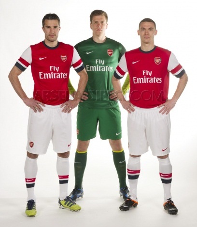
Arsenal have revealed their new 2012/13 home kit today ( May 7, 2012) to add to the other Premier League kit releases from Norwich and Chelsea ( home) and Swansea and Newcastle United ( away). The new Arsenal 2012/13 kit sees Nike introduce a dramatic hooped sleeve design that has clearly split the fans’ opinion of the strip, with some liking the design and others rejecting it outright.
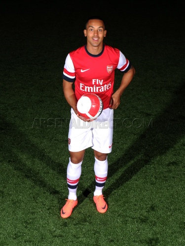
Arsenal’s new home strip for 2012/2013 is inspired by a retro look 1930’s design and winger Theo Walcott has said that it is a tribute to the Britishness of the club, with Nike having one eye on the 2012 London Olympics while designing the top.
Arsenal stars are here seen modelling the new kit in the pics below.


why have they changed there badge
i get the blue and why its there, but i just hate the design, especially the blue collar, but i hope it will grow on me
I don’t understand why everyone is complaining about this shirt :S
It’s far from terrible, even more so when compared to United’s shirts this year.
As for the people not understanding why the blue; the team originally wore royal blue (the proper, traditional royal blue) shorts back in 1889 when you were known as Royal Arsenal.
The first introduction of royal blue on your shirts seems to be in 1982.
For me, Nike putting the royal blue back on the shirt is a nice touch.
I just can’t wait to see what Kappa are planning with my teams away kit this year 😀
its not that bad come people
i like it !!
It’s coz arsene is French so cut it a bit of slack. Don’t think it looks too bad
This jersey looks weird, moreover what is with the blue white and red sleeve? What is Wenger even thinking? Just because Wenger wants to keep ONE Holland player and make the entire team to wear Holland sleeves. Seriously, would does other player think? Wenger, that is not wise at all and not fair for other Arsanal players.
this jersey lookalike my high school t-shirt. lmao
u people are soo dumb call urself arsenal fans the sleeve is like that becuz its the netherlands flag and he done that becuz he wants van perise to stay
Good to see arsenal supporting the rangers crisis.
I thought the discussion is about the arsenal kit…why are people discussing man utd here…..its a bad mentality.
its at least better than the man u kit
I love this new home kit, i have placed an order with my Pet name on it, and i cant wait for the start of the season,this jersey will look great on Van Persie,Song,Podoski,M`villa pls,with this jersey we have to WIN a trophy.
I totally love the home kit,it actually looks stylish..The dash of Navy blue is cool,i love the stripes and i think RVP looks amazing in his jersey.Just placed an order for mine,cant wait.. Looking forward to winning trophies with Arsenal.
Adrian Tan May 19, 2012 7:34 pm
what on earth gave you the impression that Arsene Wenger is in charge of kit design?! Just when i thought the blame wenger game couldn’t get any more illogical…
big shit, another trophless season
All the comments are about how crap this kit is and your all right its total shit, just keep it simple like 2006 or so and dont make the players look like homo salors with their sleeve’s
99% of the idiots commenting here are have no idea what they are talking about..just because someone else has commented negative, all are doing the same thing……..this looks very good in my opinion…
We in ghana can’t wait to purchase the new jursey. Its nice & we congratulate nike for the wonderful design.
As long as it is Arsenal, everything is perfect to me 😀
The more I look at it, the more I am loving it. This is actually a nice kit. 2010/2011 is beautiful. 2011/2012 is classic looking. Except the crest as mine peel off after about ten washes. Anyone experienced that too? 🙁 Luckily Arsenal and Nike chose to have the crest stitched on this year..:-)
Not blue only red!.Not expected from nike
I believe the blue-white-red symbolised the flag of France (nationality of our Great Mr Arsene Wenger). I believe Nike want the players to remember who they are playing for and to wear their heart on sleeve and to express themselves openly on the field. Go out and show those who despise us!!
This kit should bring some new luck to the club. And win all the trophies in ENGLAND. Good luck gunners!.
Umm….the design could be better,is that really the best nike came up with?
dont like this kit why the blue. ilike the black mix .in total who ever designed it lacked ideas.
the kit z gud. Damn yall who dont like t.
the kit sucks,nikes rubbish its bad already there trophyless
r we a french team or wat is arsene tryin to promote the french national team
Jus had ma customised jersey yesterday.It realy looks weird for ma likin.Nike must stop giving us dese stuff.
Arsenal is now changing the kit in order to take the trophies after it has failed to do so for almost seven years that is shit.I request all arsenal ferns to come and join MANU UNITED, TROPHY WINNERS.
That is a c**se from nike for Arsenal’s in coming season 2012/2013.It might even be relegated,shit me jam shifting to mancity.
To be truthfull this jersey is not fine
This is another year to see Arsenal winning…. Go Gunners Go
Yh bad kit but so what it’s not about what they were its about how they play
Well..well..well..y iz d nederlands flag on it…datz not fair..prefer d away jersey by ffaaaaaaaar!nd rvp shud go..betar 2 cash on him nd get som1 dat can use both ryt nd left …or he stayz nd plays well diz season..HONESTLY i DONT tnk RVP can shine elsewhere..GOOONAZ for LIFE!
not fit for arsenal mmmmmmh
british trbute or french
this is rubbish, to hell with nike, lets go back to our 1994 jersey
puma, pls come to our rescue, this is ridiculous