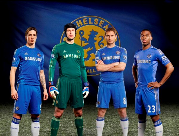
Adidas have unveiled today the new Chelsea shirt 2012-2013, the strip that will be worn by the likes of Frank Lampard and Fernando Torres in the forthcoming 12/13 season. Chelsea’s new 12/13 home strip features a dash of gold on the club crest and on the stripes to mark the city of London.
Chelsea are the only Premier League biggies with Adidas following Liverpool’s switch to Warrior Sports. Arsenal and Manchester United are both with Nike, Spurs are with Under Armour, while Man City are outfitted by Umbro.
Goalkeeper Petr Cech’s 12/13 home shirt will be a green creation from Adidas, as can be seen from the picture below.

F no it’s 2 ugly
Looks lyk f shit huh
It luvly and superb
it like this season one but less white
Looks horrible!!!
shite
Awesome!!!~
mmmm fantastic
awesome
Orribile
Wow it looks superb amazing with the goalkeeper kit and the home kt
nice
Looks like someones just washed it with some darker clothes and the colours ran :’) Adidas, what you playing at? :’)
This years kits were wayy better. the Blue faint stripes for home and the black away were great. And Cech in white looked amazing flying through the air. Unless the green is tactical to hide him, I wish they just kept the 2010/2011 kits unchanged. Just bought the away kit before they replace it..
Mo Maame tw3!
The blue without the white colour is incomplete because the sky is made up of the two colours
Very good and luvly i want a pair of these ?
This is fantastic!
Nice simple look. As a Chelsea supporter we haven’t gotten that much over the years. Though the past few home kits were good looking, but for me this kit is wonderful. Best home kit in years edging out the 11/12 kit. There is still plenty of white with this kit. Let’s just hope our away and 3rd strips aren’t awful like this past years. Keep it simple Adidas. Simple is classy and we like classy. Give us some Real Madrid style away and 3rd kits with some different colors. Maybe black/orange with no crazy grey whatever lines down the front? Heck an all white/navy or all white with navy and yellow minus the odd ball chest design. Just keep it simple. I can handle wild colors, but the wd designs on our away and 3rd has to go. These kits represent Chelsea FC when we go on the road. Remember that. Germany always have good looking away kits to go with their home. Just bc we are in London doesn’t mean we need something overly flashy. Just classy
Gold accents when we’re going to be playing in the Channel 5 cup next season, ummmm….
Looks like Liverpool’s 2011/12 kit almost but other from that pretty classic Adidas kit
hahaha why does the idiot cech wear the daft scrum cap for publicity shots? looks like a knob
I want 2 know d price of d new golden jersey pls.
@bawbag, cech has to wear it because in 2006 season his suffered a cranium fracture from steven hunts’ knee and was seen as career ending injury but he came back and now has to wear it for protection so don’t criticize him because obviously you don’t know shit!
Fine kit,
@team blue, Dude, im not hating anyone here but for the sake of taking pictures, its not a problem if he doesnt wear it. But i dont mind actually, already used to see him that way so its kinda weird if he doesnt wear it.
Looks amazing! All you haters will hate even more when they have a star above the badge next season lol
they should keep the 2011-12 away kit the same looks awesome
although the new home kut also looks good
Cool,but not much difference,that sucks
Not Much Difference,But I wnt 1!
Cool Goalie Kit
It managable
It just like d previous one
These are the golden boys of the champion, goodluck as u put it on, up blues!
This is just pretty…the golden colour is pretty okay,hope they get ? golden season#wink
These kits looks fantastic and dangerous as well, hope it will give threat to any opposition that comes our way.
I luv dis new kit its d best among d rest.am a chelsea fan till i die.
I need d chelsea shirt badly
It’s nice the blues
not bad
I luv chelsea still e blues
Chelsea need a strong midfielder, players like malaouda, bosingwa, kalou drogba need nt to be in next Chelsea. We thank them for all d effort in making Chelsea today, bt we need a fress Chelsea so that we d die heart will hv cause to smile. Tanks.
petr cech is fat
i mean it
drogba should take bye bye with chelsea fc
why does it have silver for the adidas stripes and samsung instead of white
@simon Then you must be really skinny if you think he is fat..
I love how most of the bad comments of hate toward this beautiful home kit are no doubt from arsenal and Manchester united supporters. Maybe even some Barcelona supporters as well. Look at your own kits and let Chelsea supporters enjoy their new and lovely 12-13 home kit preview 🙂
I really love everything about chelsea, d only problem I have now is for Robato Dimatio to buy a sharp midfilder like Modric or Shenider so we can have a tyt team. Wish all chelsea fan good ahead Blues runs in my fain.
Not good at all. The metallic effect print actually makes the shirt look a bit cheap. The blue should be darker and the stripes should be white. An almost Navy blue would have been classy, this looks like it was made by orphans in a back street in Manila! Oh… Wait…